The Curse of the Beast
The Curse of the Beast is a game that my uncle created for fun. He had originally made the board using crayons and cardboard and his cards were made with foam and paper. He put a lot of effort into creating something that spoke to him and that effort spoke to me. I offered to make a design for his game because I was up for the challenge and I wanted to see his vision come to life.
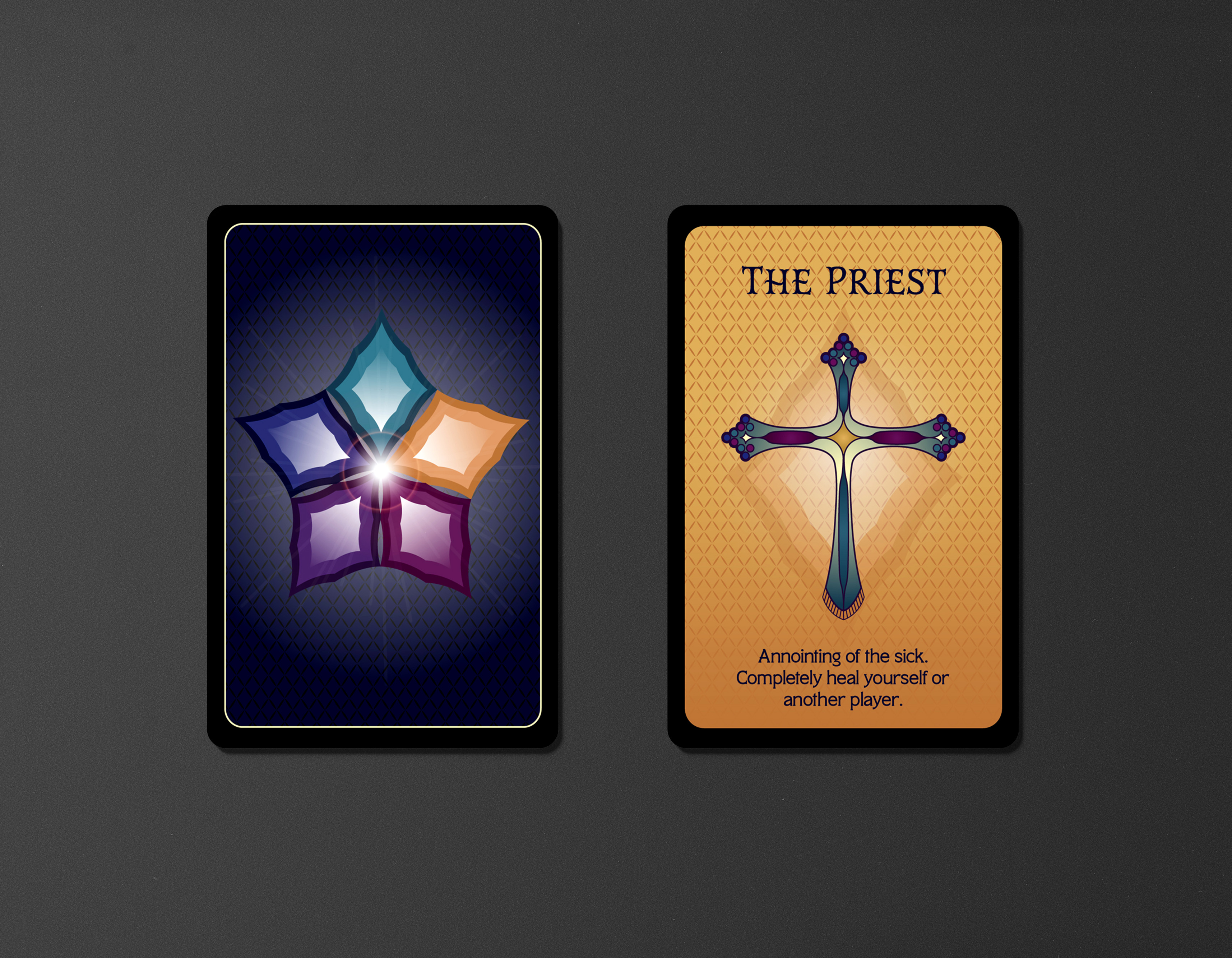
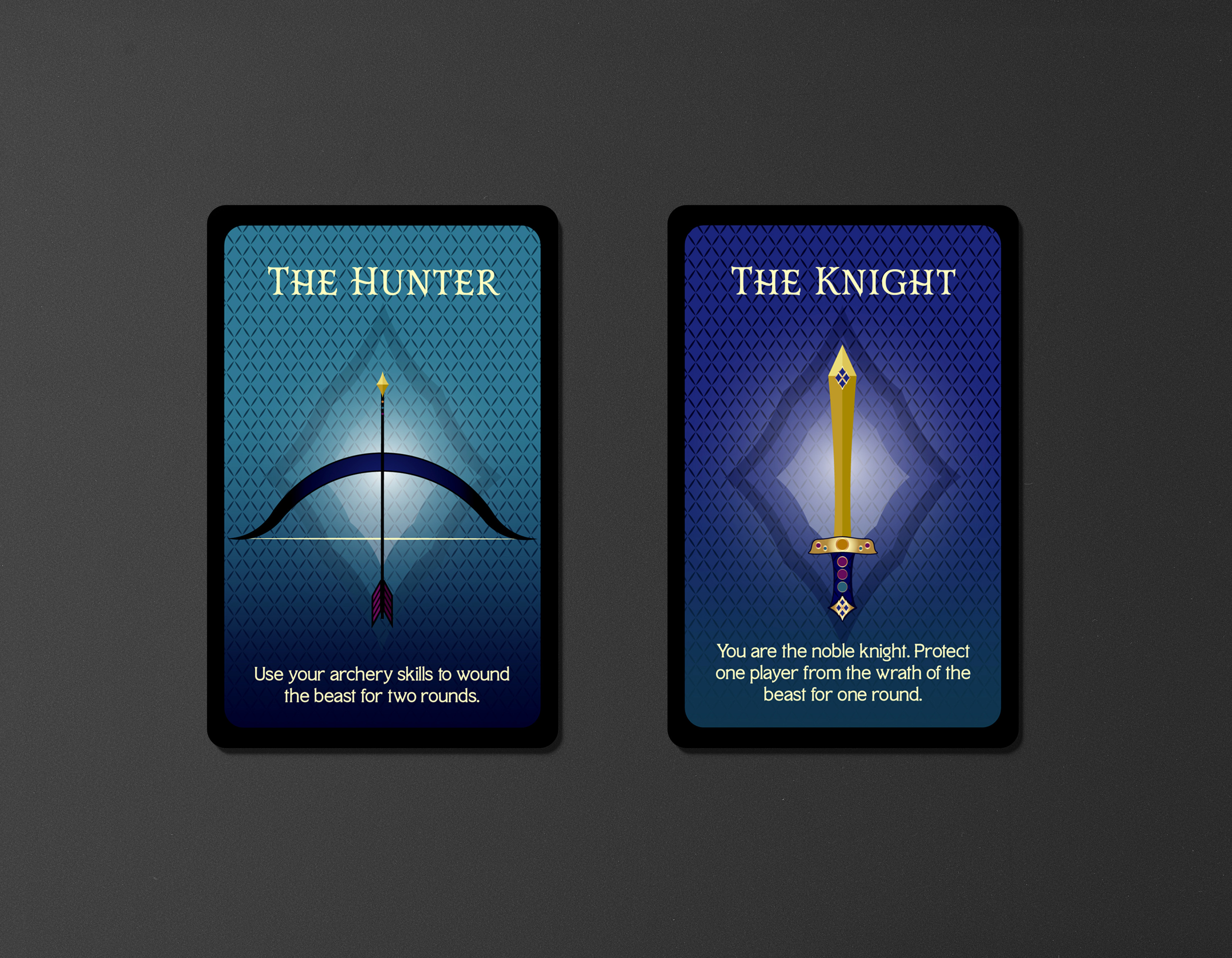
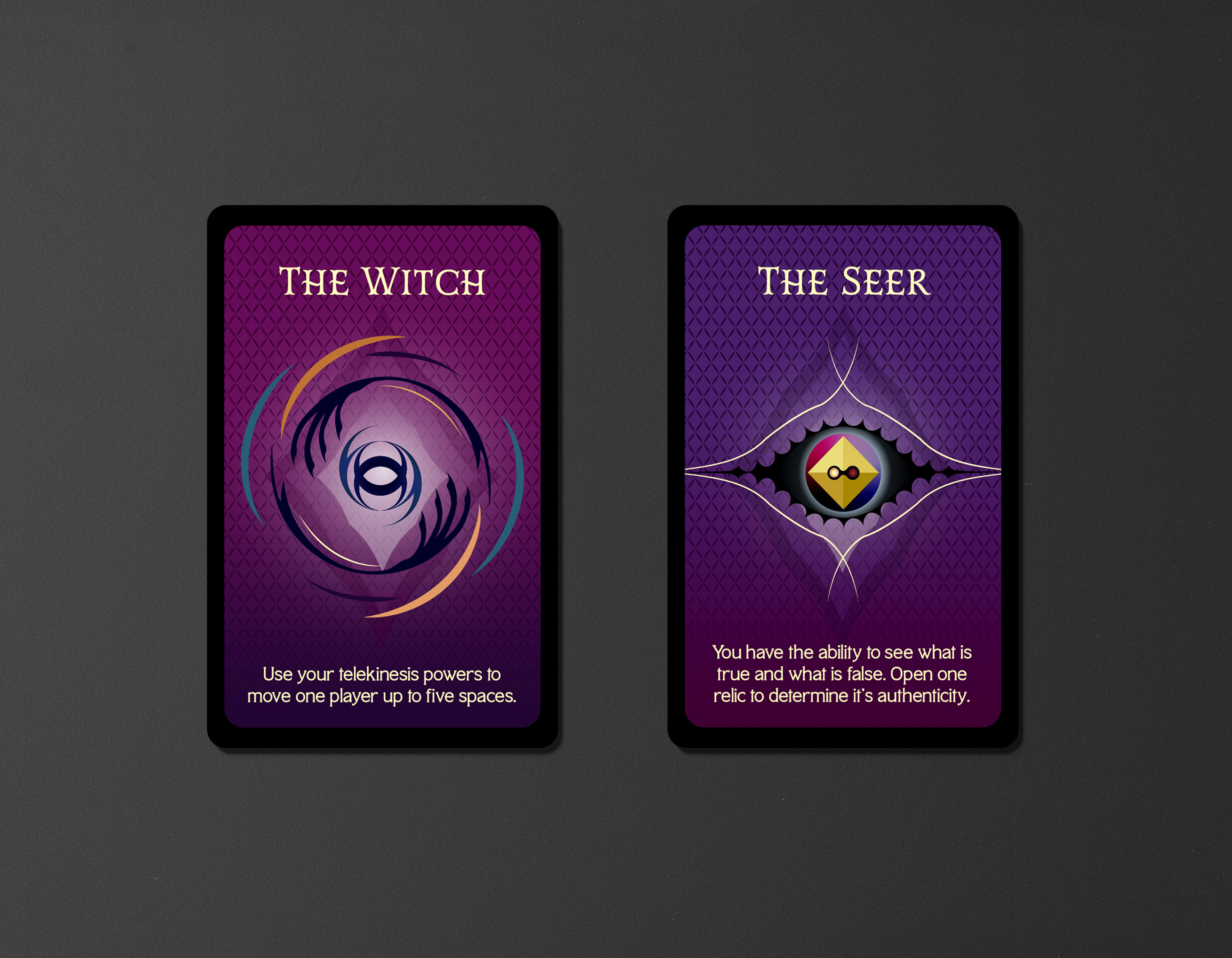
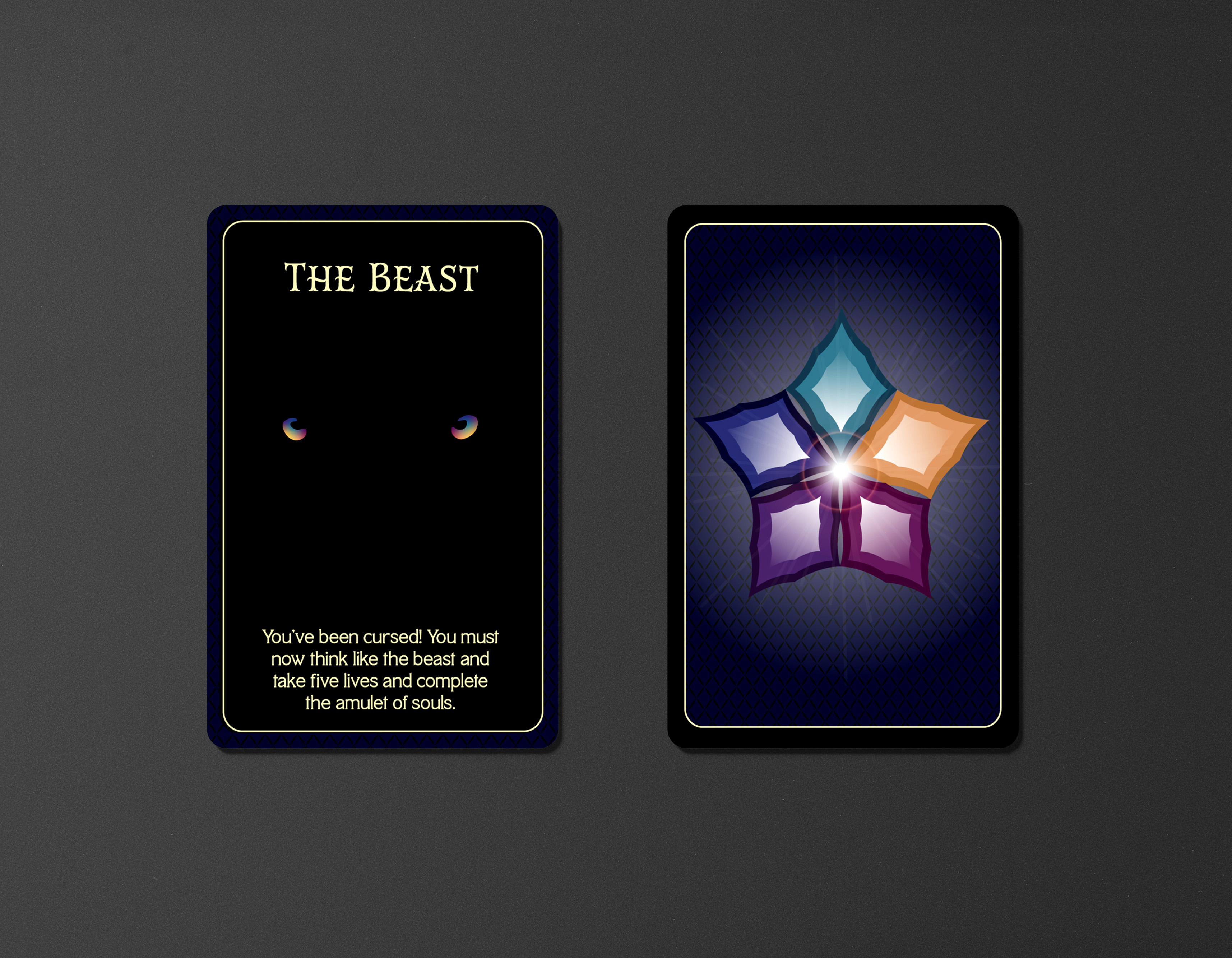
In the game, there are up to 6 players and each of them have their own card. Each player can look at their own card but must keep it hidden from the others until they chose to use their ability which is represented on the card. The beast has to reveal their card after the first round and the other players must run from him and open the relics in order to cure him. But there are false relics among them and they must open all of the true relics in order to win.
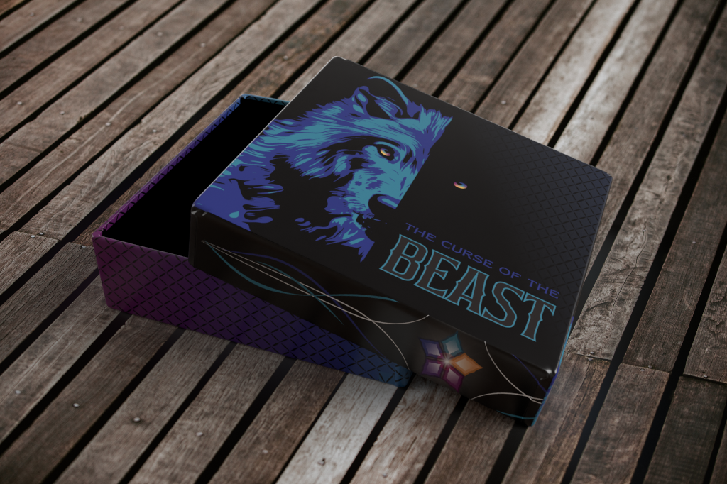
This fantasy game of luck and strategy is thrilling and fun, so I wanted to make sure the packaging showed that. I chose bright colors to contrast against the black and serve as the light amongst the darkness. This contrast of colors relates directly to the game and the colors represent the heros as the darkness represents the beast and the curse. In order for the beast to win, he must defeat the players and take a life amulet each time. Players respawn but one amulet is lost. This amulet is represented by the multicolor star that is included on the packaging and the cards. Each color represents the 5 players and each one has a specific color. The nature of the game deals with magic and I wanted to show that so I added swirls in places to make it look like energy or power.
Overall, I think that the packaging design is really connecting to the elements of the game and the
story which was my intended goal. The dark with the contrast of the colors creates a beautifully
contrast and the choice of colors add to the mystery and the magic of the game.