Farmer’s
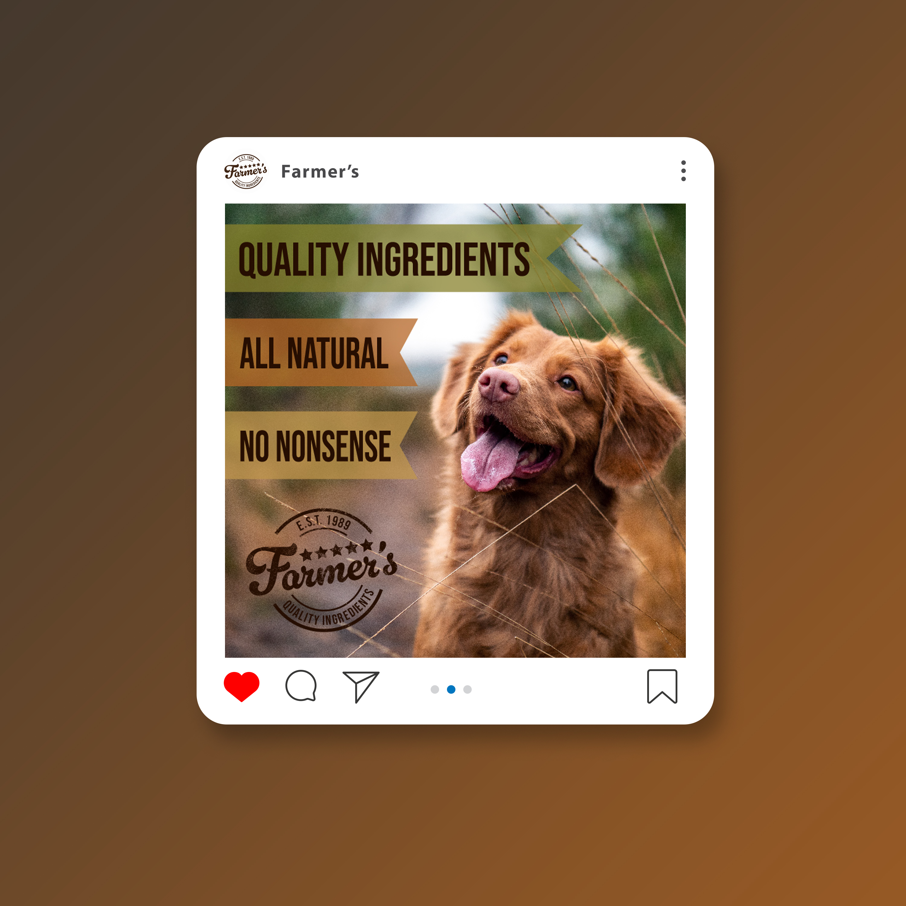
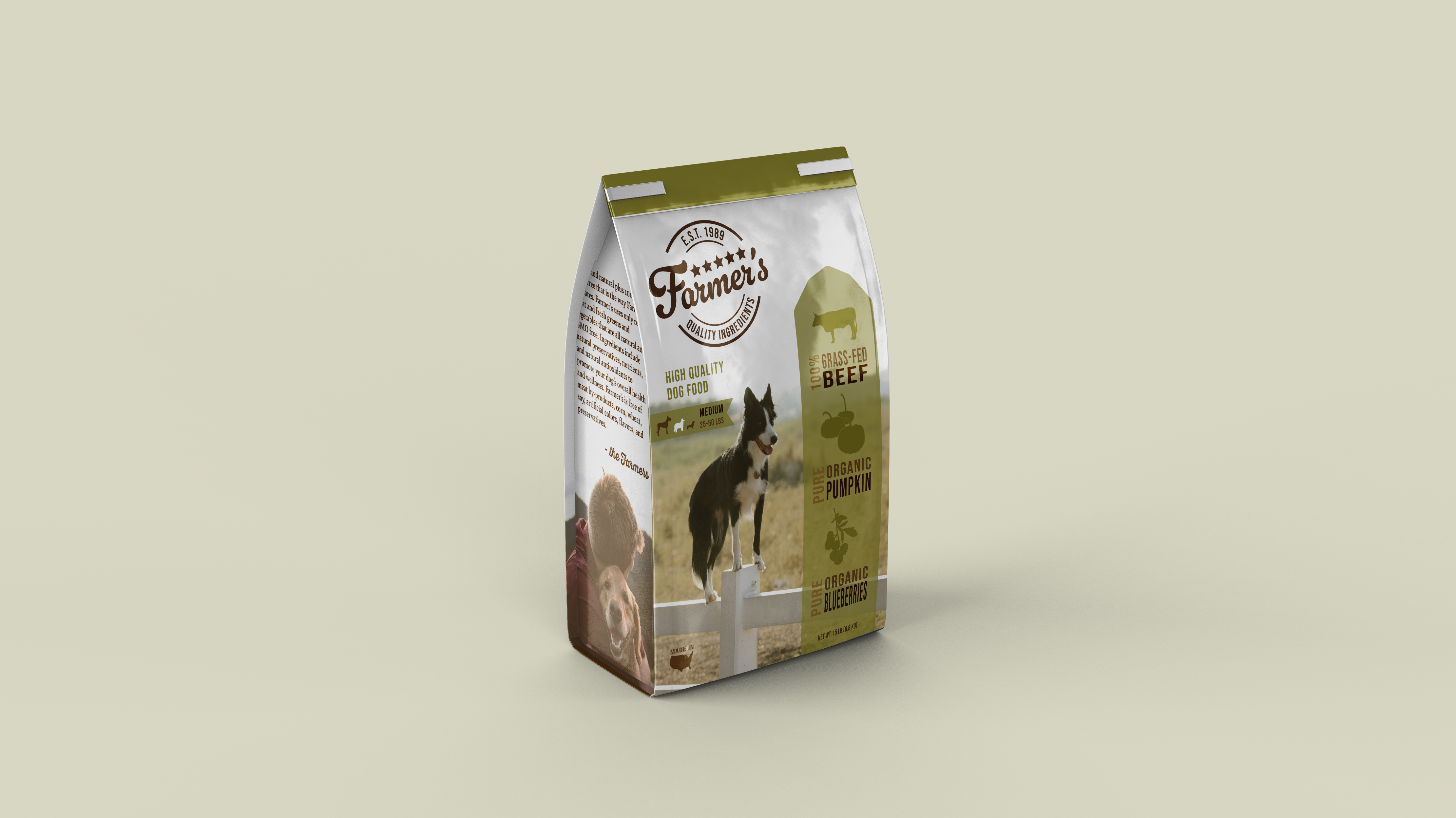
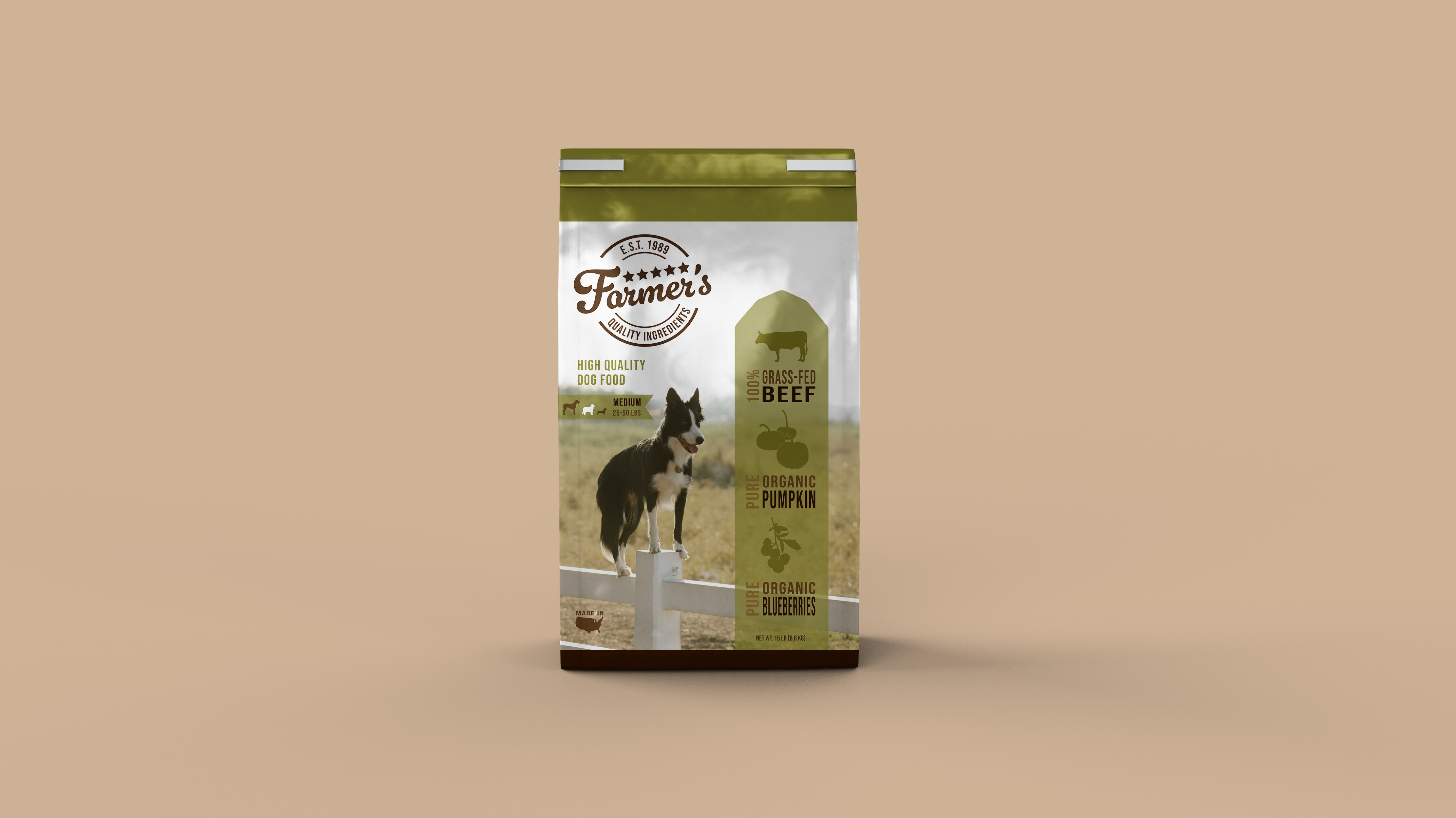
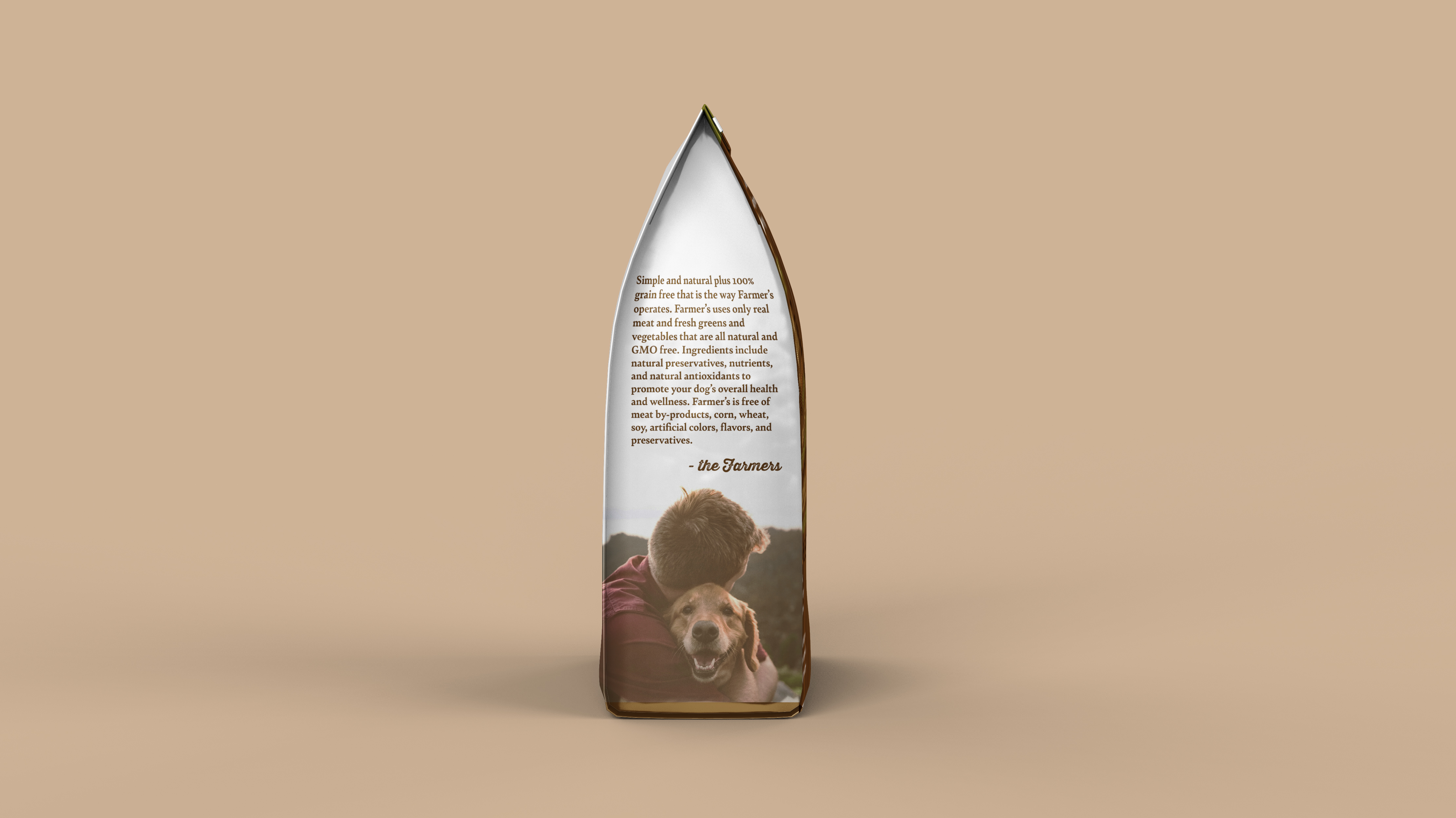
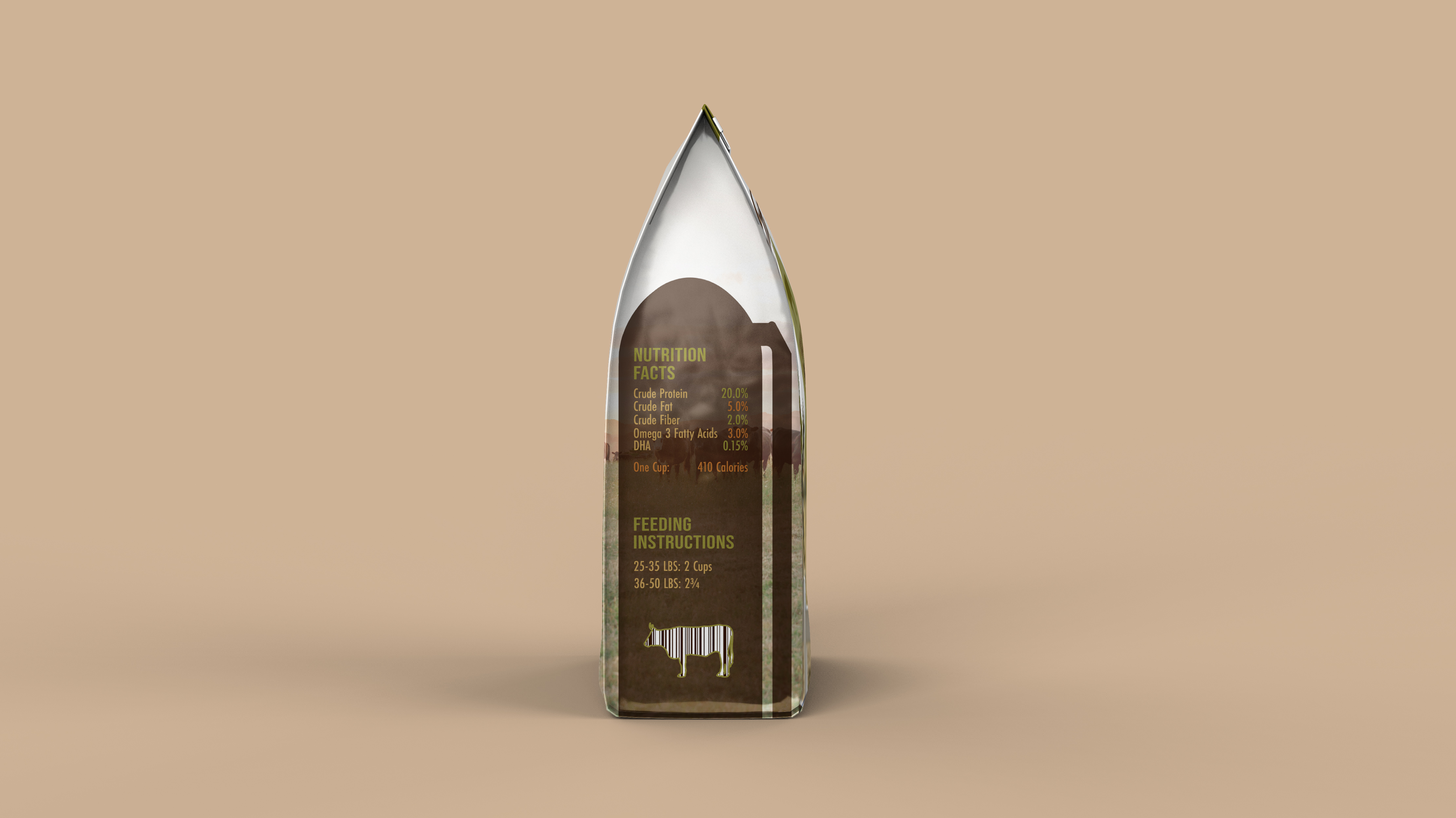
Farmer’s is a pet food brand that I created that offers high quality natural ingredients to pet owners. For the design, I went with natural earthy colors to add to the organic quality of the product. I also chose a more personal font for the logo with an all caps sans serif to add a stamp like quality to reference approval of the quality of the ingredients. For this design my focus was on photography and how to incorporate that into design. I tried to choose photos that utilized rule of thirds in some way so I could add information into the photo without creating confusion. Font was another one of my focuses for this. I chose a few different fonts that would complement this brand and design. The all caps font (Bebas Neue Regular) was the one that I played around most with. I liked the boldness of it and I wanted to try to play with it in order to give more depth, so I enlarged, stretched, squeezed, and flipped the font in some areas to keep a more balanced look but create movement at the same time. Dogs are full of energy and they are the movement in this design. The reliable quality of the ingredients represent the structure and balance throughout.